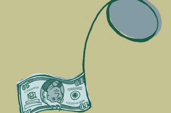
Every year since the very first Riverwest 24 in 2008, the team has introduced a new tattoo design that bestows 5 bonus laps onto ride participants. The designs have ranged from cool to tacky and upon first glance they’re almost always questionable. The quality of line varies tremendously, but that’s arguably either the aesthetic or […]
Continue reading…Category: Design
The inelegance of viewing app updates in Windows 8
Viewing app updates in Windows 8 is a pain in the ass. When you see a small number in the corner of your Windows 8 Store tile this means you some apps with new versions. To get started you open the Windows 8 Store and then click the Updates link in the top corner. Good […]
Continue reading…Out with the old, in with the new: Redesigning OnMilwaukee for 2012
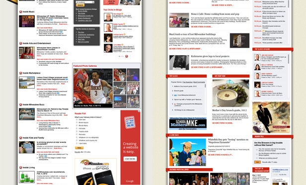
Redesigning the new OnMilwaukee may have been among the biggest undertakings I’ve had to embark upon since starting at the media company, but the whole thing started on a whim. I had a little free time and I took a look at a couple of small elements. But the more I pushed the data around, the […]
Continue reading…I’ve been nominated for Best Album Art (twice!)
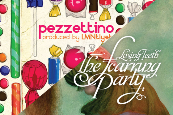
It looks like I’ve been nominated for Best Album Art (twice!) for Radio Milwaukee’s Fourth Annual Milwaukee Music Awards! Nomination #1 was for The Scarring Party’s “Losing Teeth” For this album I did the typography, layout design, and back illustration. The main illustration was provided by Ray Caesar. Nomination #2 was for Pezzettino’s “Lub Dub” […]
Continue reading…Two new albums worth checking out (and not just because I was involved)
The Scarring Party has been one of my favorite bands from its inception. Lead singer Daniel Bullock has managed to combine folk, old-timey, and punk ethos into a sound that isn’t duplicated anywhere else. And really, I’m not just saying that. Please let me know if you’ve heard anything remotely similar anywhere else. There are […]
Continue reading…The plea for Janet Zweig
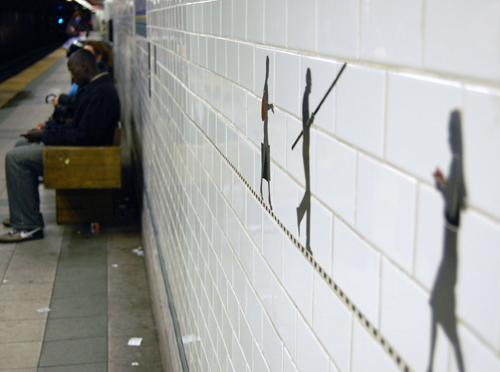
According to JSOnline’s Mary Louise Schumacher, Janet Zweig’s public art project, which has been in the works for three years, has come under scrutiny despite receiving “unanimous support from an advisory committee of business leaders and art experts.” Zweig’s installation would essentially consist of five kiosks that would contain flipbook–style animations mounted in retrofitted transportation […]
Continue reading…Clutter, tchotchkes, and minimalism
I used to live in an apartment with four other people. Each person had their own definitive style and managed to find a lot of unique ways to decorate the place. There were action figures, owls, candles, artwork, and more hanging on the walls, sitting on the mantle, and lining the halls. We were also […]
Continue reading…Teecycle.org and ThinkMKE.com Logo Development
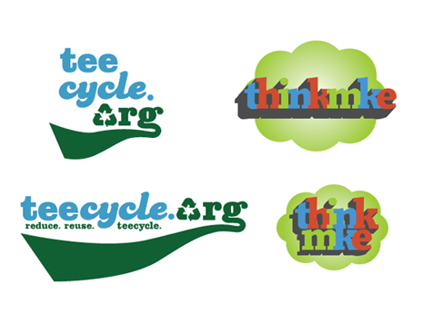
Over the last few weeks I’ve been working with a couple of different people regarding logo design: Tim Cigleske of Teecycle.org and Steve Glynn of Spreenkler. Teecycle.org Teecycle.org’s old logo was in need of an overhaul. The green in it was a bit dark and overbearing and it was improperly sized on the site. The […]
Continue reading…Walmart*’s questionable logo
Walmart* just gave up one of their truly unique branding opportunities. When one typed out their initial logo, instead of a dash, most would use a star (or asterisk). Wal*Mart. It’s a truly unique position they had put themselves into, by being able to separate their brand name with an non-traditional ASCII character. Where most […]
Continue reading…Google Transit: Ford the Milwaukee River
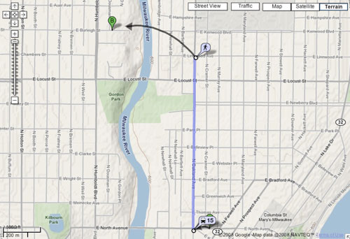
Google just recently released a useful new app called Google Transit, which takes bus information and applies it to it’s map app. This sounds infinitely more useful than anything the DOT or the Wisconsin government can throw together and is much more user friendly for those who don’t know how to use a computer. Arguably […]
Continue reading…Dali for flappers
I was recently given the opportunity to design a couple of small pins for a band called The Scarring Party. They take early jazz and old-timey music and mix it together with a punk attitude and a bit of irreverence. They describe themselves as “End-Timey” music, which is about as short and accurate a description that […]
Continue reading…A Drawing Club: Because idle hands are the devil’s playthings
I have a new idea for a new “inspirational/collaborative” project in order to have a reason to keep on drawing. I’ve been lurking on a blog called “The Drawing Club”, where a bunch of artists get together and do drawings and paintings of live models. I like this idea, and I really wish I could […]
Continue reading…The download card
Okay, so this site isn’t exactly in working order, but I’m gonna put something else up here, cuz I’m sick of looking at the last post. So what works? Basically everything on the right-hand column works…i.e. the links that take you out of my site (so make sure to return!). The perma-links mostly work, but […]
Continue reading…
