The main mechanic of On the Rivet is the card-driven movement, and over the years I’ve tried to balance them perfectly between simplicity and understand-ability.
You can follow through each variation as I worked towards that goal.
The original card was based off a pre-existing design from a car-racing game called “Thunder Alley,” but even so I had already made design decisions with the (admittedly borrowed) icons. After years of modifications and iterations, it’s clear the game shares a common lineage, but it has been transformed into something all its own.
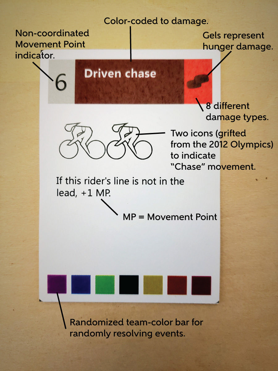
Color coding was an early choice, but I was still hesitant to fill up the card with too much text (such as the name of the movement type). I wanted it to be all about the icons.
It didn’t take long for me to figure out that adding the Action type was a wise move. I also developed a set of cyclist icons that would become the foundation of the game’s design.
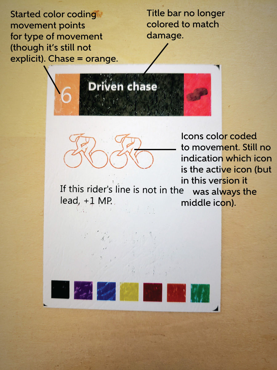
Other parts of the game were changing, too (such as how event appearance and resolution worked, so where I had to add some elements to make the cards easier to understand, I could remove superfluous ones as well.
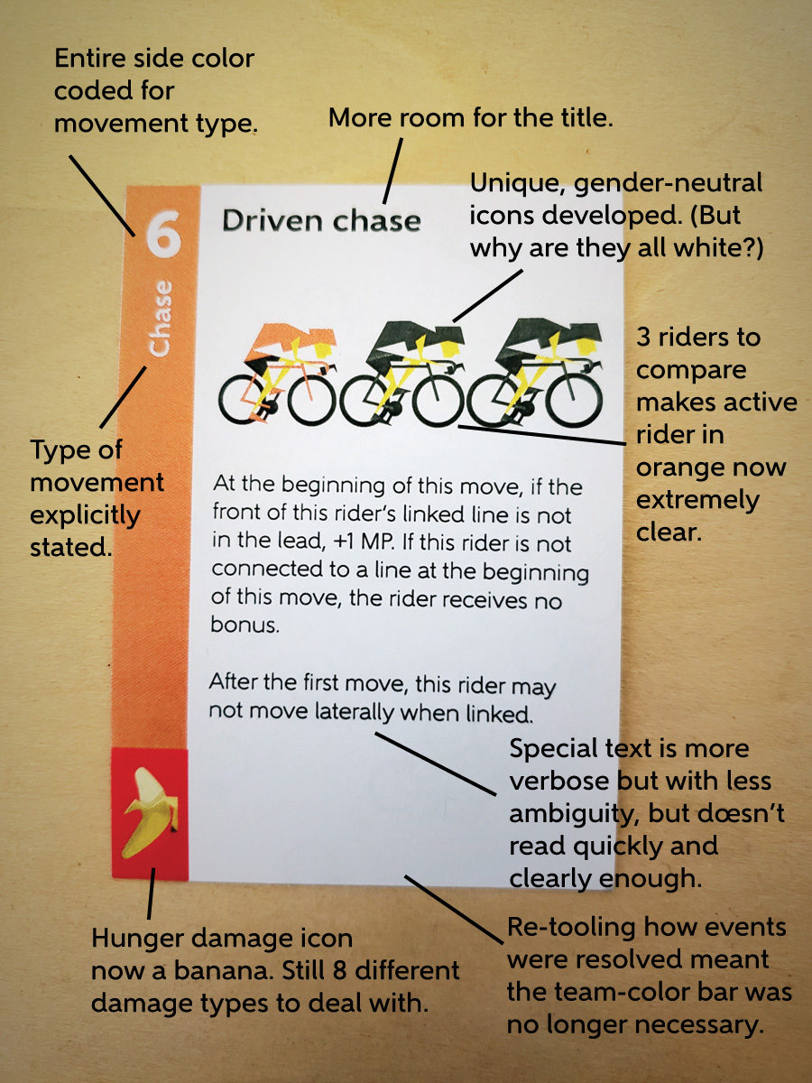
Standard movement restrictions would haunt me for a long time, because they were important to understand, but often forgotten, even when explicitly written on the card. Ultimately it came down to better iconography and better placement on the card (much later).
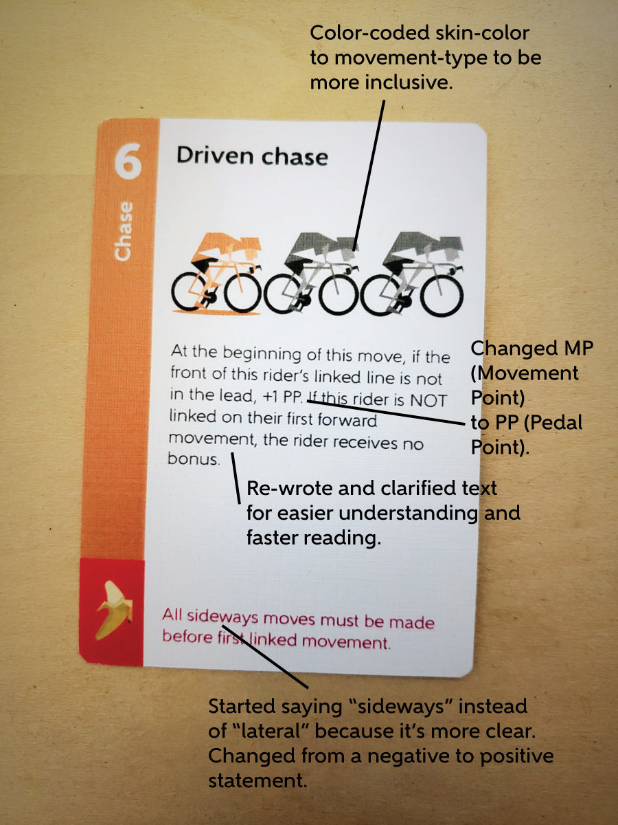
It took me a long time to realize that, even though I was striving to make the game as inclusive as possible (gender-neutral icons, gender-balanced and worldly teams, larger text, mitigating color blindness and low-light color problems, etc.) I was still coloring all the cyclists with light skinned. After that “oh duh” moment, it was an easy fix.
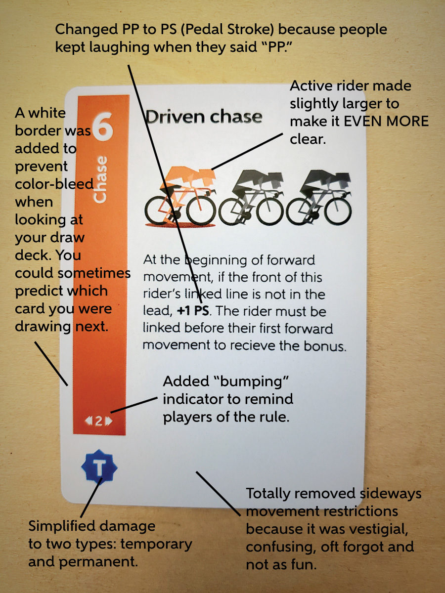
I wanted to have border-less cards because I liked the blocky look, but the colors bled through the deck, so when you were looking at the side of it, there was potential that you could predict your next card, so I had to go back to a border.
This is a step where simplifying the game helped it play faster, but I still was able to keep the flavor of the theme. Damage chits were marked by one of two generic icons on one side, but 1 of 8 flavor icons on the other.
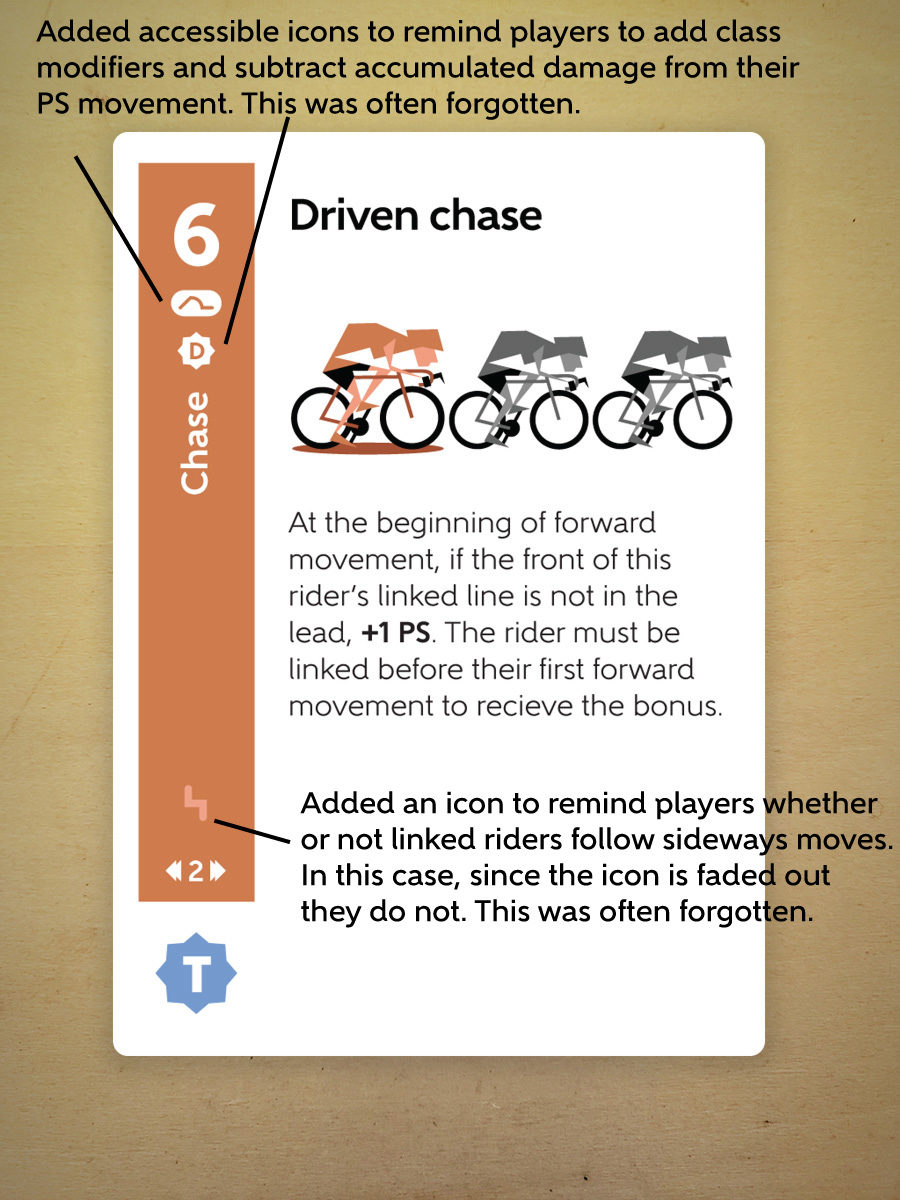
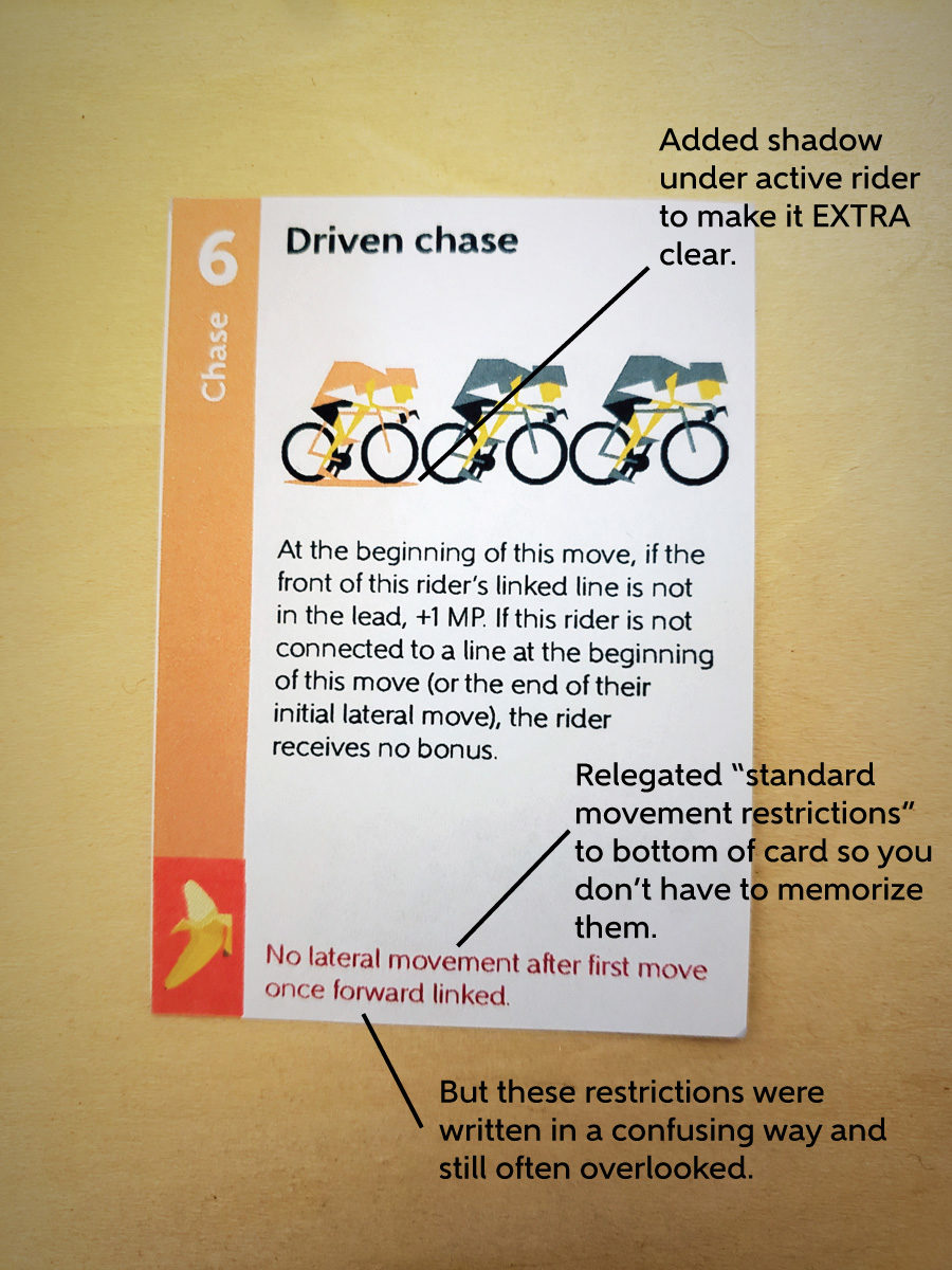
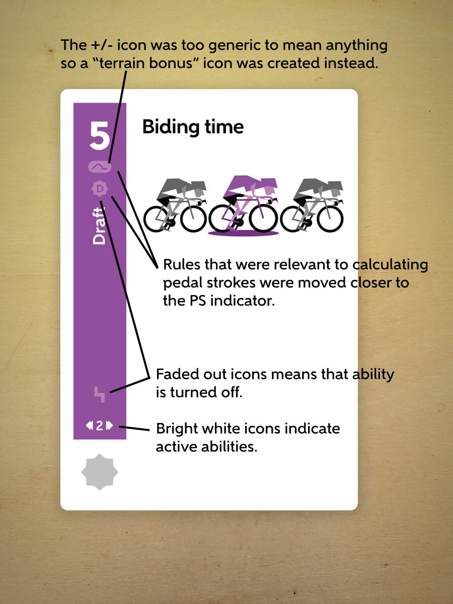
The latest variation has helpful icon reminders that turn on and off depending on the movement type. You have to memorize the rules behind these icons, but once you do, they’ll read in an instant.
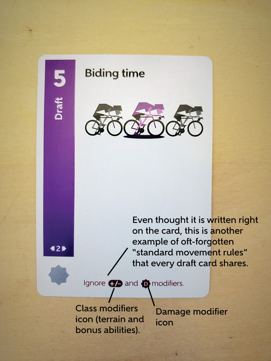
Here is another example from a different movement type.
It’s easy to believe you’ve created something brilliant, only to watch players trip up on rules after you’ve explained them clearly. And it’s easy to convince yourself that “they’ll eventually get it if they just think about it a little more” even while watching them fail over and over again.
But it’s a great feeling when you admit a shortcoming, iterate through a solution, and realize a few weeks later that you haven’t had to explain it again. Hoping that 7th time is a charm!