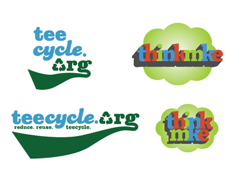
Over the last few weeks I’ve been working with a couple of different people regarding logo design: Tim Cigleske of Teecycle.org and Steve Glynn of Spreenkler.
Teecycle.org
Teecycle.org’s old logo was in need of an overhaul. The green in it was a bit dark and overbearing and it was improperly sized on the site. The chosen font wasn’t particularly strong or representative of anything. When I set to work on the new version there were two requirements for the new Teecycle logo: It had to have the universal recycle symbol in it and it had to use the color green.
I started out with a three-color logo, using blue, red and green, but eventually we decided to knock it down to two colors. I preferred the red, but fearing a too-strong association to Christmas we ultimately leaned towards green and blue.
Two fonts were used. Clarendon Black was chosen for it’s sportier, stronger look while Candice was used make the mark a little more lighthearted with a nod towards retro. The swoop underneath helps with this as well.
The swoop is also representative of a nature trail or a green river since the organization donates $1 from every purchase to River Revitalization projects.
A square, or vertical logo was also included, as well as a Favicon, however current WordPress restrictions don’t allow for the replacement of the Favicon.
ThinkMKE
The Greater Milwaukee Committee was looking for a light–hearted, more adventurous design for their soon to be released blog, ThinkMKE which is located at thinkmke.com. Since this is an offshoot of the official committee I did some research into the goals of the GMC itself. Their biggest ideals are Leadership, Community, Diversity, and Development.
The typeface is highly representative of the strength of the organization. The letters are bolder, thicker, and stronger. They are accented with thicker slab serifs yet those serifs still hold a bit of a curve and grace to them.
The varying letter heights and blocky forms are reminiscent of a panoramic skyline view of Milwaukee and the letters are spaced tightly together to bring home the essence of a tight knit, supportive community.
The colors of the letters vary between the three primary values: red, green, and blue. These colors are foundational in design, echoing strength, diversity, and possibility. And while these colors are at their essence primary, they are not perfect representations. The red is slightly warmer, the blue is a little more crisp, and the green is brighter, more welcoming.
The logo itself springs from the page positively moving forward and rising upward.
Finally, the logotype is set on top of an abstract thought balloon. ThinkMKE.
As far as it’s target audience goes, this logo is certainly a radical departure from the very corporate GMC site. It’s more fun, more active, and more exciting.
Ultimately this is not the final product. While the blog has been set forth and is currently being updated, the identity project was unfortunately halted.
Archived Comments
These comments were pulled from the archives after a site failure in mid 2014. Though I no longer accept public comments on my site, I’ve included them for posterity. If you’d like to submit a comment, send one to littletinyfish@littletinyfish.com.

— Teecycle_Tim · 2008-10-30 12:06 · #