As Creative Director, I was the lead designer for the latest iteration of OnMilwaukee.
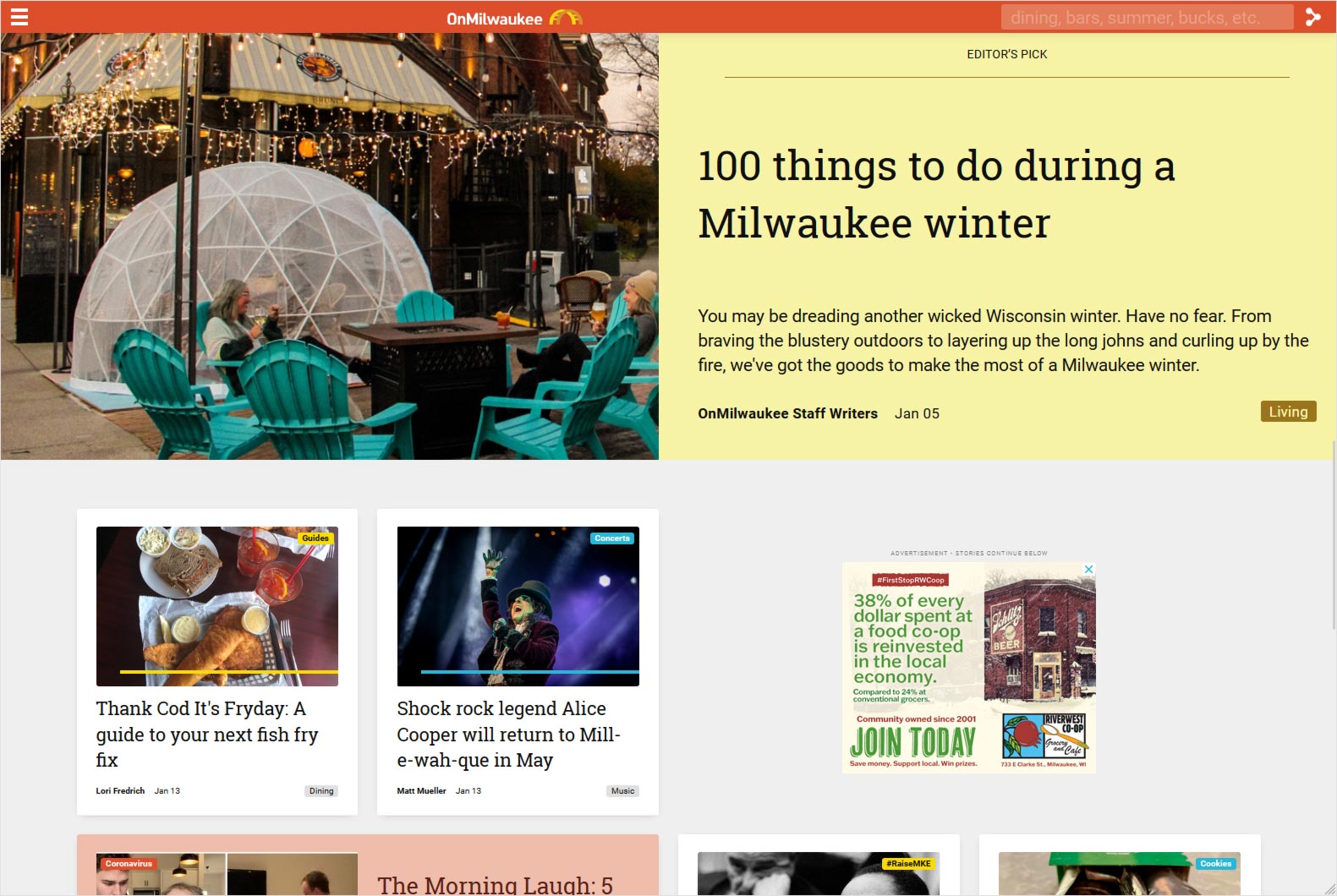
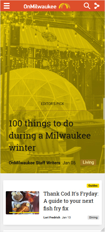
As more and more users access the web via mobile devices, I wanted the site to be easy to use. I also wanted to make it distinct from many other local white or beige media sites by bringing color to the forefront. When you first land on a story on OnMilwaukee you know where you are.
Some features
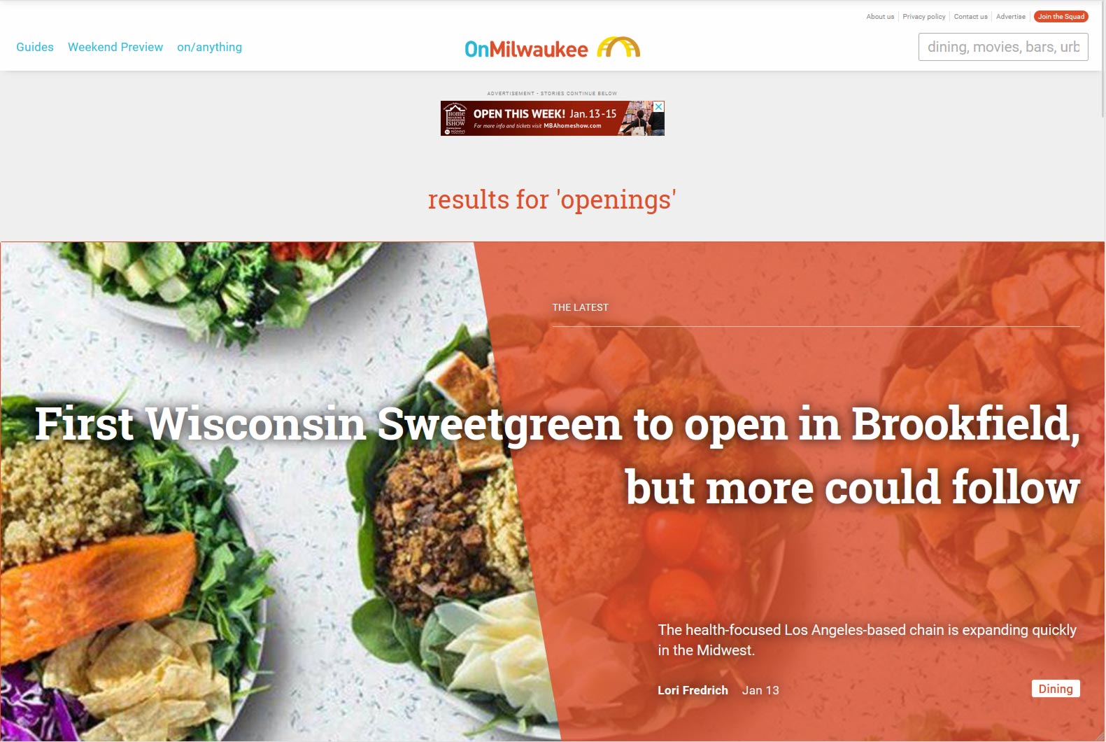
/on
Depending on how you look at it, they either expanded their sections or did away with them altogether. Instead of being limited to narrow sections, like Sports or Arts & Entertainment or Business, users can searching for keywords using /on and be brought to customized landing pages with content tagged with those keywords.
They could then create sections, promotions and series on the fly without struggling to categorize them in a specific way.
It also creates a shorthand for branding. The more they push /on, the more it will be at the forefront of peoples’ minds.
Premium ad slots
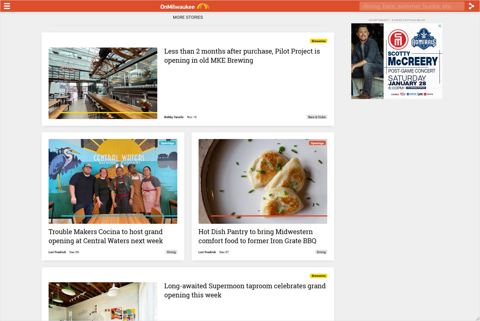
I pushed the idea that fewer, but larger ads on the page will increase the value to the advertiser. The old model relied on ads stacked on ads, which diluted the already limited attention span of internet users. Fewer ads meant a greater amount of attention spent on ads and better click-thru rates.
Sample gallery
You can preview some samples below or visit the site at onmilwaukee.com.