Redesigning the new OnMilwaukee may have been among the biggest undertakings I’ve had to embark upon since starting at the media company, but the whole thing started on a whim. I had a little free time and I took a look at a couple of small elements. But the more I pushed the data around, the more I realized we could probably be presenting our information a lot more clearly.
I scrapped the small ideas and started looking at the bigger picture. This was the result.
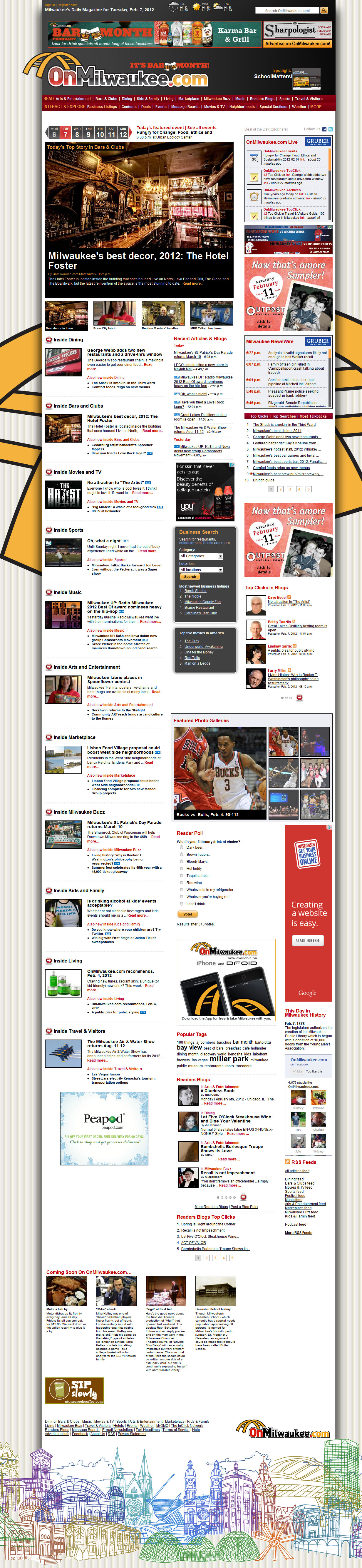
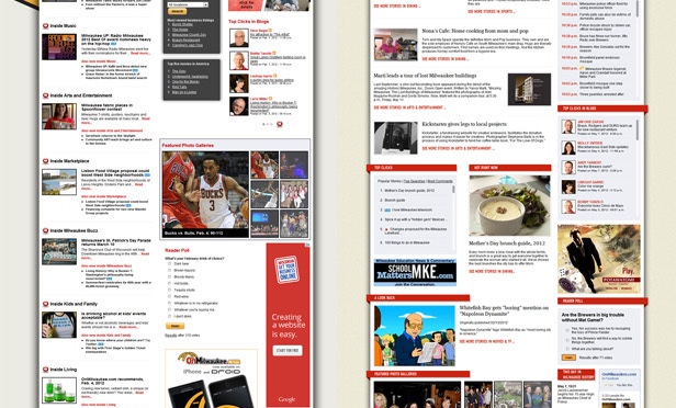
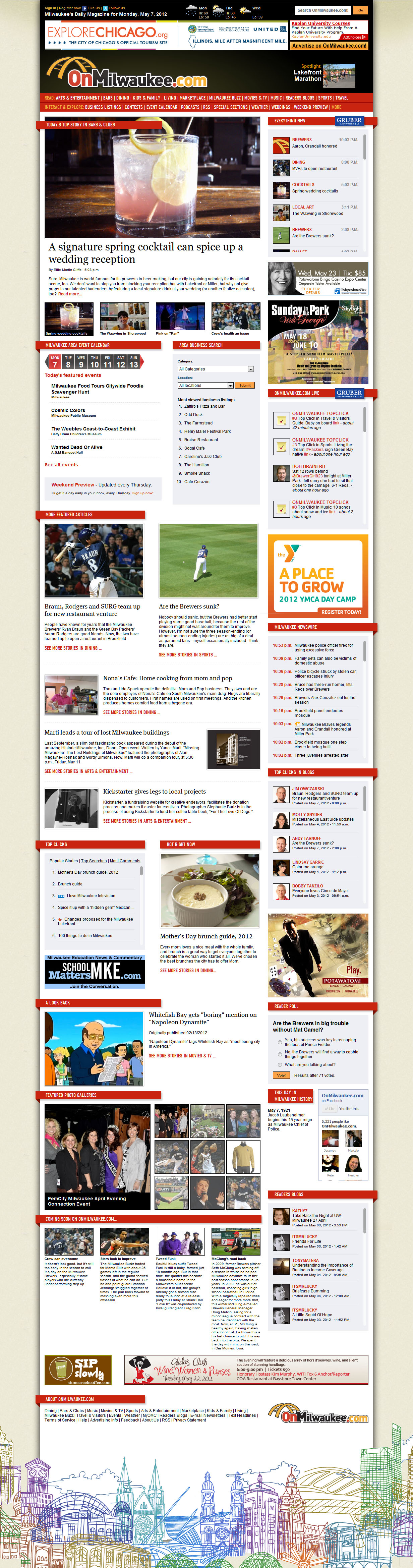
There are quite a few differences between the old site and the new site. You may instantly see (to the left) that the new site feels much more open and inviting. I wanted to make sure there was a lot more breathing room on the new site. There is significantly less text on the new design but it’s only about 12% shorter. This is because the information that is left in tact has a lot more space to exist.
On top of the extra space I worked to unify the design elements. The red banners help separate the sections. The widgets all have a unified background color. Instead of having three or four different forms of widget navigation I cut it down to one. I also developed a grid pattern to help decide how large certain elements should be and how much space should be allotted between them.
The biggest change, as far as usability goes, is the presentation of information. We discarded the formality of having sections on the home page. Articles are still organized, structurally, within sections that you can access from the navigation bar, but on the front page those sections matter less. What matters more is the newness of information. Initially the redesign asked for a Twitter-style list of new stories, but other staff members wanted a more curated feel. They didn’t want quick blogs to have the same importance as the better composed stories. So we moved the new article list to the top and added a more magazine-like, curated section on the main page. This allows users to a) easily see which articles are new and b) easily see which articles are most important.
The business listing widget was simplified, while the event calendar was given more presence. Our Weekend Preview, an important weekly article, also finds prominence on the front page. In the old design it had a tendency to disappear quiet quickly. Now there is a permanent link right on the homepage.
The logo was updated to move away from the passe Web 2.0 look to the softer gradients that are more pervasive in design today.
Listed here are only the major considerations for the entire redesign. There were countless other smaller calls that added up to one big idea.
You can see full-sized images of the old site and compare it with what the new site has to offer.